
Magic link login
NewA passwordless sign-in on a phone: welcome, email with a drawn keyboard, then check your inbox.
magic-link-login/magic-link-login.tsxAccess your agreements
from anywhere
Check your inbox for the magic link
Click the link in the email we
sent to login
The live component, numbered part by part. Every measurement is read from it as it is drawn. Point at a row to outline its part, or at a part to find its row.
When to use
- A passwordless sign-in on a phone, where one email address is all you ask for and the link does the rest.
- A product people open now and then (agreements, bookings, receipts), where a forgotten password costs more than a trip to the inbox.
- Presenting or prototyping a sign-in flow end to end: welcome, address, check your inbox, with real validation and a resend wait.
- A flow that offers other ways in (passkey, security key, phone number) but leads with email.
When not to use
- An app opened many times a day. A link per session is a chore; use passkeys or a remembered session.
- Where the inbox is on another device or often slow. Use a one-time code typed into a code input instead.
- A desktop or web form. It is drawn as a 390-point phone; on a page use a plain email field and button.
- Sign-in with a password or SSO only. Use a standard login form with its own fields and provider buttons.
- A signup that needs more than an address (name, plan, terms). Use a multi-step form; this asks for one field.
You can add this component with the shadcn CLI or by hand:
Into components/magic-link-login of any React project, with no setup:
npx shadcn@latest add https://brunodelorence.com/r/magic-link-login.json- Copy the component files
Copy these files into one folder of your project, keeping their relative imports together, or download them as a ZIP:
- Copy the media files
To the same paths under your project’s public folder:
- Import it
As shown under Usage, below.
Either way it needs React 19.2 and a bundler that supports CSS Modules, such as Next.js or Vite. It has a dark colour scheme: it follows your page’s color-scheme, light unless the page sets one, or its colorScheme prop, with nothing to configure. Browsers without light-dark() show it light.
Usage
import { MagicLinkLogin } from './magic-link-login';export function SignInPreview() { return <MagicLinkLogin autoplay={false} colorScheme="system" />;}Each state below is a live instance, locked so you can study it.
The pieces it is built from, each with its measurements read live.
One phone walks through a magic-link sign-in in three screens that push and pop like a navigation stack. The email field is checked for real, the drawn keyboard types into it (and so does yours), and the last screen pops an unread badge, drops a mail notification and makes Resend wait out a countdown.
- The phone is drawn in CSS: a 390 × 844 screen with a 9:41 status bar and a home indicator inside a green frame. It keeps that size inside and is scaled down as a whole (a ResizeObserver works out the factor) to fit a smaller stage.
- The screens push and pop: the new one slides in from the right on an iOS-like curve over 480 ms while the one it covers drifts a third of the way left and dims. The two login screens share one header, and only the sheet under it pushes.
- From the left edge, a drag pulls the screen back by hand (the one under it follows a third as fast); let go past a third of the width, or with a flick, and it pops, otherwise it springs home.
- The field is a text input with the email keyboard and autofill hints. The drawn keyboard (letters, 123, #+=, shift, delete that repeats while held, return) types at the caret with buttons that never take the focus; each pressed letter shows its callout. Real keystrokes light the key they match, and on a touch screen the device’s own keyboard stays down.
- Continue checks the address (a local part, an @, a domain and a TLD of letters). A wrong one shakes the field with the Web Animations API and says what is wrong in red under it; a good one shows a spinner, then pushes the inbox screen, where the badge pops in on an overshoot.
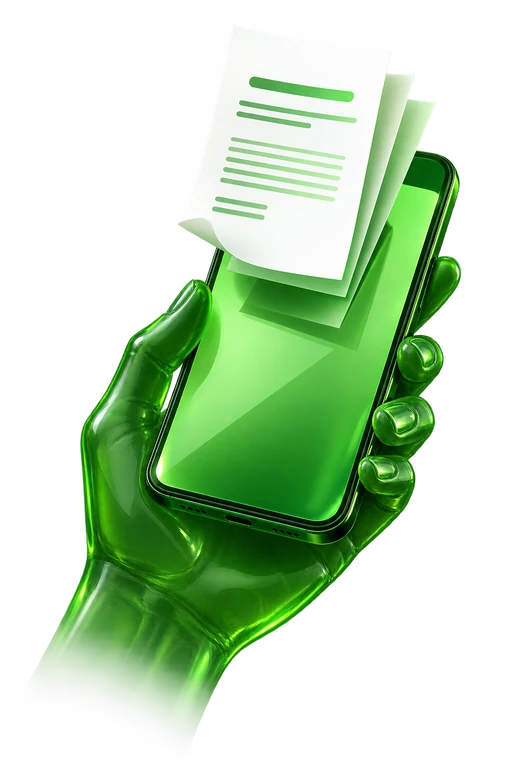
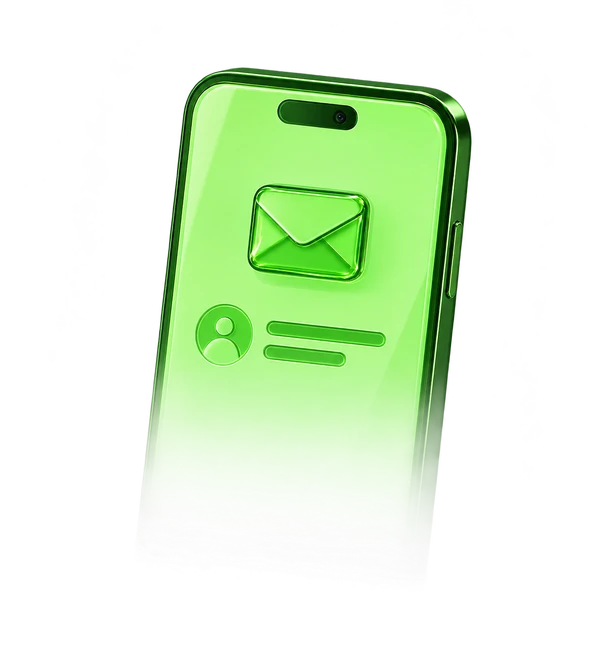
- Resend adds to the badge and counts 30 seconds down before it can send again; Open Mail App drops a notification banner from the top. The welcome and inbox use transparent raster 3D renders with dimensional green glass materials; the inbox fades through a CSS mask. The unread count and controls remain live UI.
- While on screen and untouched, a demo finger walks the whole flow: it types an address on the drawn keyboard, is turned down once, fixes it, sends, resends, opens the mail and goes back. Any real input hands the phone to the reader.
| Prop | Type | Default | Description |
|---|---|---|---|
autoplay | boolean | true | While on screen and untouched, a demo walks through the whole sign-in. Any real input hands the phone to the reader; the demo takes over again 6 s after their last one. |
colorScheme | 'light' | 'dark' | 'system' | — | Light or dark colours, or the reader’s; without it, the page’s color-scheme. |
className | string | — | Classes for the stage. |
defaultState | 'welcome' | 'other-way' | 'email' | 'invalid' | 'sending' | 'inbox' | 'resent' | 'mail' | — | Opens on this moment of the flow and holds it there: a sign-in way not set up, the email screen, a refused address, sending, the inbox, just resent (the countdown runs) or the mail notification. Turns the demo off. |
defaultEmail | string | — | What the field holds when it opens, and on the inbox the address the link went to. Turns the demo off. |
onSend | (email: string) => void | — | Called when Continue accepts the address and the link is sent. |
onResend | (email: string) => void | — | Called when Resend sends another link, before its 30 s wait. |
onScreenChange | (screen: 'welcome' | 'email' | 'inbox') => void | — | Called when the phone pushes or pops to another screen. |
The complete source behind this demo. Open source under the MIT license, © 2026 Bruno Delorence: copy it, change it, ship it.
// Copyright (c) 2026 Bruno Delorence. MIT License.'use client';import { useEffect, useEffectEvent, useId, useLayoutEffect, useRef, useState, type CSSProperties, type FormEvent, type KeyboardEvent as ReactKeyboardEvent, type PointerEvent as ReactPointerEvent,} from 'react';import { BackArrow, Badge, Envelope, InboxArt, KeyGlyph, PasskeyGlyph, PhoneGlyph,// Copyright (c) 2026 Bruno Delorence. MIT License.'use client';import { useEffect, useRef, useState, type PointerEvent as ReactPointerEvent } from 'react';import { DeleteIcon, EmojiIcon, MicIcon, ShiftIcon } from './art';import styles from './magic-link-login.module.css';/* * The drawn on-screen keyboard: letters, then numbers and punctuation (123), then symbols (#+=), * with shift, delete, space and return. Its keys are buttons that never take the focus (a press * keeps the caret in the field) and stay out of the tab order: the real keyboard types into the * field directly, and lights the key it matches. A pressed letter shows its callout above the * key; delete repeats while held. */export type Layer = 'letters' | 'numbers' | 'symbols';export type KeyAction = | { kind: 'char'; value: string } | { kind: 'shift' } | { kind: 'delete' } | { kind: 'layer'; to: Layer } | { kind: 'return' };// Copyright (c) 2026 Bruno Delorence. MIT License.'use client';import styles from './magic-link-login.module.css';/* The two hero objects are transparent raster 3D renders. UI icons and the live unread * count stay vector so they remain crisp and respond to the flow's state. *//** The welcome wordmark, kept as crisp live type above the rendered object. */export function Wordmark() { return ( <span className={styles.wordmark} aria-hidden="true"> OVIA </span> );}/** The green glass hand, phone and floating agreement sheets, rendered in 3D. */export function WelcomeArt() { return ( <img className={styles.welcomeArt} src="/experiments/magic-link-login/welcome-3d-v1.webp"'use client';import { useCallback, useEffect, useRef, useState } from 'react';/* * When a demo may play on its own: while part of it is on screen and the tab is visible, never * under reduced motion, and not while the reader is using it. `take()` hands it to the reader; it * takes back over `idle` ms after their last input. */export function useAutoplay<T extends HTMLElement>(idle = 6000) { const ref = useRef<T>(null); const [visible, setVisible] = useState(false); const [reduced, setReduced] = useState(true); const [taken, setTaken] = useState(false); const timer = useRef(0); useEffect(() => { const element = ref.current; if (!element) return; let onScreen = false; const update = () => setVisible(onScreen && !document.hidden); const observer = new IntersectionObserver( ([entry]) => { onScreen = entry.isIntersecting;/* Magic link login (magic-link-login.tsx): a quiet stage with a phone in its middle. The phone's screen is 390 × 844 and every size inside it is in its own points (px); the whole phone is scaled down, never re-laid out, to fit a smaller stage. Colours are the tokens below, light-dark(light, dark) where the two differ: the component takes the color-scheme it inherits from the page (light unless the page says otherwise), or the one its colorScheme prop sets (data-color-scheme). The art and the phone's green frame keep their own colours on both. Motion. Screens push and pop by transforms on the same iOS-like curve; the keyboard rises and falls with them; the badge pops on a small overshoot. Under reduced motion, everything switches at once and nothing shakes or spins. */.root { /* The stage. */ --stage: #fff; /* Welcome: a vertical green gradient, its wordmark and its words. */ --welcome-top: #75e06c; --welcome-bottom: #cbff8b; --brand: #1d6b18; --ink: #0a0a0a; --ink-2: #111; /* The white button and the round ones on the welcome, and their lift. */ --surface: #fff;- Each screen is a labelled section; the ones off screen are inert, so neither the Tab key nor a screen reader reaches them.
- The email field has a real label (the question above it) and is described by the hint under it, which turns into the error message; a refused address sets aria-invalid.
- Focus follows the reader: into the field on the email screen, onto the heading of the inbox screen, back to the button that came before on the way back.
- The drawn keys are buttons with spoken names (period, at, delete, shift with its pressed state), kept out of the tab order since the real keyboard types into the field directly.
- Sending, resending, the notification and refusals are announced through a polite live region; the unread count is also given in words.
- The art, the demo finger and the status bar are decorative and hidden from assistive technology.
- Under reduced motion the demo never plays, the screens switch at once, and nothing shakes, spins or blinks.