
Call lobby
AdvancedNewA video call’s waiting room: check your mic and camera while you wait, and the host slides in.
call-lobby/call-lobby.tsxWaiting for host…
We’re waiting for the other person to arrive, whilst you wait make sure your mic and camera settings are correct.
Jonah joined
The call has started. Say hello when you’re ready, your mic and camera stay just as they are.
The live component, numbered part by part. Every measurement is read from it as it is drawn. Point at a row to outline its part, or at a part to find its row.
When to use
- The moment before a video call starts, while the person waits for a host to let the call begin.
- Checking the microphone, the speaker and the camera before anyone else can see or hear you.
- Calls with one host who opens them: a consultation, an interview, a lesson, office hours.
- Showing an arrival as it happens: the card says who joined and their picture slides in, with nothing to reload.
When not to use
- The call itself, with several people on screen. Use a call grid with a speaker view.
- Calls anyone can open at once, with no host to wait for. Go straight into the call.
- Audio-only calls: the picture is most of the lobby. Use a compact device check instead.
- Setting devices outside a call, for good. That belongs in the app’s settings page.
You can add this component with the shadcn CLI or by hand:
Into components/call-lobby of any React project, with no setup:
npx shadcn@latest add https://brunodelorence.com/r/call-lobby.json- Copy the component files
Copy these files into one folder of your project, keeping their relative imports together, or download them as a ZIP:
- Copy the media files
To the same paths under your project’s public folder:
- Import it
As shown under Usage, below.
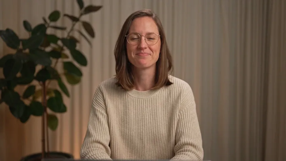
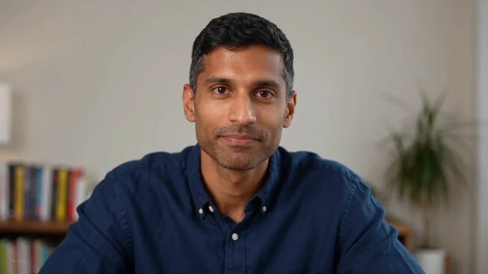
Either way it needs React 19.2 and a bundler that supports CSS Modules, such as Next.js or Vite. It has a dark colour scheme: it follows your page’s color-scheme, light unless the page sets one, or its colorScheme prop, with nothing to configure. Browsers without light-dark() show it light.
Usage
import { CallLobby, type LobbyAction } from './call-lobby';export function WaitingRoom({ hostIsHere, onAction,}: { hostIsHere: boolean; onAction: (action: LobbyAction) => void;}) { return ( <CallLobby name="Maya Lind" hostName="Jonah Reyes" hostJoined={hostIsHere} onAction={onAction} autoplay={false} /> );}Each state below is a live instance, locked so you can study it.
The pieces it is built from, each with its measurements read live.
The lobby of a video call. Your camera’s picture fills the window inside a thin golden edge, a card says the host is not there yet, and the bar below lets you mute, switch devices and go full screen. When the host arrives, the card greets them and their picture slides in.
- Every state is in the page from the start: both icons of each toggle, the avatar for a camera that is off, the host’s picture, both faces of the card and every menu. A change flips data attributes, and the stylesheet swaps, fades and slides with transforms and opacity.
- The window is drawn in one unit, a 685th of the stage’s width, so it keeps its proportions at any width. A narrow stage switches to a larger fixed unit so its words stay readable, and full screen sizes the unit from the screen.
- The camera feeds are local MP4 clips of two fictional adults, generated with Seedance 2.5 through Higgsfield. They are demonstration footage, not live camera or microphone capture. Picking another camera reframes the whole video. Supply selfFeed and hostFeed to use your own clips.
- The videos start silently and only play while the lobby is visible in an active tab. Turning your camera off pauses your feed; the host’s feed plays only after they join. The call-audio button enables one voice at a time with English captions, independently of the microphone toggle.
- The device menus follow the menu pattern (arrow keys, Home, End, Escape) and close when you click elsewhere. Full screen uses the browser’s own, and its button hides where there is none.
- When hostJoined turns true, the chip turns to Connected, the card becomes “Jonah joined” and leaves a few seconds later, and the host’s picture springs in at the top right. Parts that change during the demo paint on small layers of their own, and the spinners stop off screen.
- Every interface colour is a light-dark() token on the root, so the lobby follows the page’s color-scheme, or the colorScheme prop: a white window on a pale slate by day, with grey pills on a white bar and white menus, card and tooltips; the dark window at night. The camera pictures, and what sits on them, are the same on both; with the camera off, the full-screen button takes the window’s ink.
| Prop | Type | Default | Description |
|---|---|---|---|
name | string | 'Maya Lind' | Your name, on the avatar when your camera is off. |
hostName | string | 'Jonah Reyes' | The host’s name, on their picture and in the card when they join. |
hostJoined | boolean | false | Whether the host is in the call; when it turns true, the lobby greets them. |
defaultMicOn | boolean | false | Whether the microphone starts on. |
defaultCameraOn | boolean | true | Whether the camera starts on. |
defaultCamera | string | 'built-in' | The camera picked at the start: 'built-in', 'desk' or 'phone'. Given, it turns the demo off. |
defaultMenu | 'chat' | 'mic' | 'camera' | — | A device menu open at the start, without taking the focus. Turns the demo off. |
defaultCard | 'joined' | 'gone' | — | With hostJoined true at the start, the card held: 'joined' keeps the greeting up, 'gone' starts with the call under way. Turns the demo off. |
brand | string | 'Openroom' | The product’s name, at the top left. |
onAction | (action: LobbyAction) => void | — | Called when share screen, invite, more, settings or chat is pressed. |
autoplay | boolean | true | While on screen and untouched, a demo pointer tries the controls and the host arrives. |
selfFeed | LobbyFeed | Maya’s local clip | Your camera clip: { src, poster, captions? }. Captions are English WebVTT. |
hostFeed | LobbyFeed | Jonah’s local clip | The host’s clip, poster and optional English captions; plays after arrival. |
still | boolean | false | Shows the cameras’ poster pictures instead of their clips and stops the spinners. Turns the demo off. |
colorScheme | 'light' | 'dark' | 'system' | — | Its colours: light, dark, or the reader’s system setting. Without it the component follows the page’s color-scheme, which is light unless the page sets one. |
className | string | — | Extra class for the root. |
The complete source behind this demo. Open source under the MIT license, © 2026 Bruno Delorence: copy it, change it, ship it.
// Copyright (c) 2026 Bruno Delorence. MIT License.'use client';import { useEffect, useEffectEvent, useId, useRef, useState, type CSSProperties, type KeyboardEvent, type ReactNode,} from 'react';import { DemoPointer, runDemo, type Demo } from './demo-pointer';import { CameraFeed, type LobbyFeed } from './camera-feed';import { AddPersonIcon, CameraIcon, CameraOffIcon, ChatIcon, ChevronIcon, CollapseIcon, ExpandIcon,/* Call lobby (call-lobby.tsx): a slate stage with the call's window in it. Header, camera preview, control bar. Every state is drawn already; the component flips data attributes and the rules below show one face or the other, with opacity, visibility and transforms. Colours are the tokens below, light-dark(light, dark): the lobby takes the color-scheme it inherits from the page (light unless the page says otherwise), or the one its colorScheme prop sets (data-color-scheme). By day the window is white on a pale slate, at night dark on a deep one. The camera pictures are content, the same on both, and so is what sits on them: the full-screen button over your picture, and the frame round the host's. Memory. A phone keeps the page's pixels in tiles the width of the screen, and a tile painted again takes a second buffer. So every part that changes while the demo plays paints on a small layer of its own (will-change): the status chip, the card, the pills of controls and their menus, the host's picture, your picture (which moves as a whole when another camera is picked), the line for screen readers. Nothing else is painted again. None of those layers sits in a box that clips with rounded corners but your picture's own, and the stage is one layout boundary, sized from its width, so nothing inside lays out the page. The spinners stop when the lobby is off screen. */.root { /* The stage, the window, its edge and its shadow. */ --slate: #dfe1e6; --night: #fff; --edge: rgb(0 0 0 / 0.08);'use client';import { useEffect, useRef } from 'react';import styles from './call-lobby.module.css';export type LobbyFeed = { src: string; poster: string; captions?: string };/** The local clips stand in for camera streams; playback follows the lobby's visibility. */export function CameraFeed({ feed, active, audible,}: { feed: LobbyFeed; active: boolean; audible: boolean;}) { const video = useRef<HTMLVideoElement>(null); const wasAudible = useRef(false); useEffect(() => { const element = video.current; if (!element) return; let cancelled = false;'use client';import { useEffect, useRef, type KeyboardEvent, type ReactNode } from 'react';import { CheckIcon } from './icons';import styles from './call-lobby.module.css';/* * A menu of choices that opens above its button: the microphone, the speaker, the camera, the * chat. It is always in the page, hidden until open, so that opening it adds nothing to the page * and lays out nothing new. It follows the menu pattern: arrow keys, Home and End move between the * choices, Enter or Space picks one, Escape closes and hands focus back to its button. */export type Choice = { id: string; label: string; icon?: ReactNode };export type Section = { /** The heading of a group of choices. */ label: string; choices: Choice[]; value: string; onPick: (id: string) => void;};export function Menu({/* * The lobby's icons: outlines on a 24-unit grid, drawn in the current colour. Each one is a still * drawing; a control that changes state shows another icon beside it rather than restyling one. */import type { ReactNode, SVGProps } from 'react';type IconProps = SVGProps<SVGSVGElement>;function Icon({ children, ...props }: IconProps & { children: ReactNode }) { return ( <svg viewBox="0 0 24 24" fill="none" stroke="currentColor" strokeWidth="1.7" strokeLinecap="round" strokeLinejoin="round" aria-hidden="true" focusable="false" {...props} > {children} </svg>'use client';import type { CSSProperties, Ref } from 'react';/* * The demo's pointer, and the steps that move it. A demo is a script of awaited steps: wait, glide * the pointer onto a control, press it and call the component's own handler, as a click would. * Stopping the demo (the reader takes over, or it scrolls away) ends the step in progress at once: * its promise rejects, which ends the script right there, and the pointer fades out. * * The pointer is an HTML box around a still drawing: it glides by an animation the compositor * plays, and the press scales a box that keeps a transform at rest, so nothing it does needs a * layout. */export type Point = { x: number; y: number };export type Demo = { /** Resolves after `ms`. */ wait: (ms: number) => Promise<void>; /** Glides the pointer onto `target`: its middle, or a point given as shares of its size. */ moveTo: (target: Element | null | undefined, at?: Point) => Promise<void>; /** Glides the pointer to a point of the stage, as shares of its size. */ moveToStage: (at: Point) => Promise<void>;'use client';import { useCallback, useEffect, useRef, useState } from 'react';/* * When a demo may play on its own: while part of it is on screen and the tab is visible, never * under reduced motion, and not while the reader is using it. `take()` hands it to the reader; it * takes back over `idle` ms after their last input. */export function useAutoplay<T extends HTMLElement>(idle = 6000) { const ref = useRef<T>(null); const [visible, setVisible] = useState(false); const [reduced, setReduced] = useState(true); const [taken, setTaken] = useState(false); const timer = useRef(0); useEffect(() => { const element = ref.current; if (!element) return; let onScreen = false; const update = () => setVisible(onScreen && !document.hidden); const observer = new IntersectionObserver( ([entry]) => { onScreen = entry.isIntersecting;- Mic and camera are toggle buttons (aria-pressed) with tooltips. Each chevron is a menu button (aria-haspopup, aria-expanded) whose choices are radio menu items, reached with the arrow keys; Escape closes the menu and hands focus back to its button.
- Your own changes are announced in a polite live region (“Microphone on.”, “Camera: Desk camera.”), and so is a real host arrival; the demo stays silent.
- The preview footage is decorative and never starts with sound. The call-audio toggle is labelled, keyboard accessible and exposes aria-pressed. Enabling sound also shows English captions. The host’s picture is an image named after them, hidden while they are away. Every control shows a visible focus ring.
- Under reduced motion the spinners stand still, every change is instant and the automatic demo never plays. The camera feeds show still posters unless the reader explicitly enables call audio. Videos pause offscreen and in a hidden tab.