
App collection
NewFour phone screens in a 2 × 2 grid, each with its own entrance: a step ring, a streak card and two assistant orbs.
app-collection/app-collection.tsx- 10Jan
19,538 steps
Daily goal: 8,000
Goal passed · 244%
- 13.05 km
- 808 kcal
- Share
Rewards
Unlock New BotsBest Trade Yet!
Your best trade so far
 Generate New Plan
- Pricing
Your assistantfor anything.
HealthProductivityFinance
Monthly$16.99/mo Hey There! What’s On
Your Mind Today





The live component, numbered part by part. Every measurement is read from it as it is drawn. Point at a row to outline its part, or at a part to find its row.
When to use
- A showcase of a few app screens side by side: a case study, a portfolio section or a launch page that says “here is what the app looks like”.
- Screens that are worth seeing move: each phone plays its own entrance, so a still shot would lose what makes them good.
- A fixed set of two to four screens that read at a glance, each on its own tinted tile, cropped the way a photographed phone is.
- A hero or section that should feel alive without asking anything: it plays on its own, and a tap only replays a screen.
When not to use
- A working prototype people should click through. Link to the real build or an interactive prototype instead.
- More than four screens, or screens that change often. Use a scrolling gallery of static screenshots.
- Explaining a flow step by step. Use a stepper or a sequence of annotated screens, where the order is the point.
- Showing one screen in detail. Use a single large device frame, with room for callouts around it.
- Pages that must stay still (print, slides exported as images). Use stills of the final frames instead.
You can add this component with the shadcn CLI or by hand:
Into components/app-collection of any React project, with no setup:
npx shadcn@latest add https://brunodelorence.com/r/app-collection.json- Copy the component files
Copy these files into one folder of your project, keeping their relative imports together, or download them as a ZIP:
- Copy the media files
To the same paths under your project’s public folder:
/experiments/app-collection/purple-orb-v2.webp/experiments/app-collection/dark-orb-v2.webp/experiments/app-collection/streak-badge-v2.webp/experiments/app-collection/tracker-gold-v2.webp/experiments/app-collection/tracker-silver-v2.webp/experiments/app-collection/streak-fire-v2.webp/experiments/app-collection/streak-grey-v2.webp/experiments/app-collection/iridescent-star-v2.webp/experiments/app-collection/purple-satellites-v2.webp
- Import it
As shown under Usage, below.
Either way it needs React 19 and a bundler that supports CSS Modules, such as Next.js or Vite. It has a dark colour scheme: it follows your page’s color-scheme, light unless the page sets one, or its colorScheme prop, with nothing to configure. Browsers without light-dark() show it light.
Usage
import { AppCollection } from './app-collection';export function Showcase() { return <AppCollection autoplay={false} colorScheme="system" />;}Each state below is a live instance, locked so you can study it.
The pieces it is built from, each with its measurements read live.
A collection of four app screens on phones, cropped by tinted tiles. A step tracker sweeps its ring round while the count is written digit by digit; a streak card lights its second day; a purple glass assistant grows in and settles over its pricing page; a dark frosted assistant gathers its lights and opens its eyes. Each screen idles once in, the orbs look towards the pointer, a tap on a phone plays it again and a tap on an orb makes it blink. Light and dark stage.
- Each tile is drawn at 540 × 688 px and scaled as a whole to its column (a ResizeObserver works out the factor). Inside it a phone, drawn in CSS around a 390 × 844-point screen, sits at about 1.08 times and is cropped by the tile, each at the height it is shot at. Two columns from 600 px wide, one below.
- Every entrance is CSS keyframes with fill-mode both and delays timed frame by frame, and every part rests in its final state. A screen plays again when it is remounted with a new key: a tap on its tile does it, and so does the autoplay, each phone on its own period (6.2 to 7.6 s), staggered.
- The step ring is one SVG annulus with rounded ends, filled through a mask whose stroke sweeps 80.5% of a half circle in 360 ms while the needle turns with it; its glow is a blurred copy under the same mask. The count is six spans that rise and darken one after another (1, 9, the comma, 5, 3, 8), then the pills and the goal line follow.
- The streak card crossfades its second day between two transparent 3D flame renders with a small pop. A rendered iridescent glass hexagon sways behind live blinking eyes, and the button’s rendered star turns.
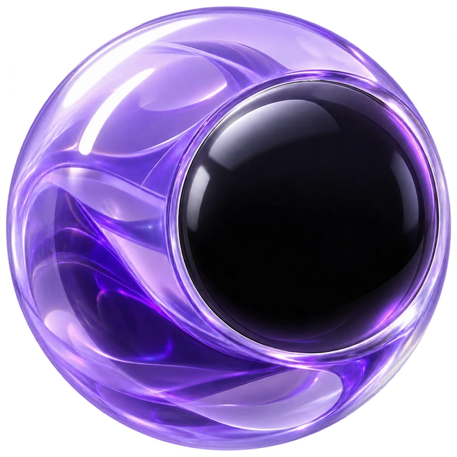
- The purple orb is a transparent raster render of violet glass, internal ribbons and a glossy black face. Its two glowing eyes remain live layers, so gaze and blinking still work. It grows in with squash and stretch, floats over a breathing shadow, and is surrounded by rendered glass miniatures; the pricing page rises line by line.
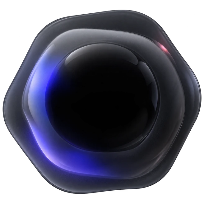
- The dark orb is a transparent render of an irregular smoked-glass shell with a glossy black center and violet and warm reflections. It gently turns and compresses at rest. Three sparks fly into it as it grows, and its live eyes open from dots into pills.
- Both orbs and their eyes lean towards the pointer (up to 9 points for the eyes), set as custom properties outside React; both blink now and then, and a tap on one makes it blink at once.
- The stage and the tiles are light-dark() tokens; the four screens keep their own designs in both schemes. The loops pause off screen or in a hidden tab, and under reduced motion every screen is drawn at rest.
| Prop | Type | Default | Description |
|---|---|---|---|
autoplay | boolean | true | While on screen and untouched, each phone plays its entrance again on its own period. Any tap hands control to the reader for six seconds. Either way, every screen plays once when the collection first comes into view. |
colorScheme | 'light' | 'dark' | 'system' | — | Light or dark stage and tiles, or the reader’s; without it, the page’s color-scheme. The screens keep their own colours. |
defaultState | { at?: number; gaze?: { x: number; y: number }; blink?: boolean } | — | Opens held still, with the autoplay off: every animation paused the given milliseconds (at) into its entrance, or at rest without it; both orbs looking towards gaze (-1 to 1 on each axis); and, with blink, their eyes half closed. A tap on a phone plays it live again. |
className | string | — | Added to the stage. |
The complete source behind this demo. Open source under the MIT license, © 2026 Bruno Delorence: copy it, change it, ship it.
// Copyright (c) 2026 Bruno Delorence. MIT License.'use client';import { useCallback, useEffect, useLayoutEffect, useRef, useState, type PointerEvent,} from 'react';import { DarkScreen, PurpleScreen, StreakScreen, TrackerScreen } from './screens';import { useAutoplay } from './use-autoplay';import styles from './app-collection.module.css';/* * App collection: four phones in a 2 × 2 grid of tinted tiles, each showing one app screen with * its own entrance: a step tracker whose ring sweeps round while its count is written digit by * digit, a streak card whose second day lights up, a purple glass assistant that grows in and * settles with its pricing page rising under it, and a dark frosted assistant that gathers its * lights and opens its eyes. * * - Each tile is drawn at 540 × 688 px and scaled as a whole to its column (a ResizeObserver works// Copyright (c) 2026 Bruno Delorence. MIT License.'use client';import { useId, type CSSProperties, type Ref } from 'react';import styles from './app-collection.module.css';/* * The four screens of the collection, each laid out at 390 × 844 points (CSS px inside the * phone): a step tracker, a streak card, a purple assistant's pricing page and a dark * assistant's greeting. Everything is placed absolutely at the points it sits at on a phone. * Their motion is CSS only: each part names its entrance keyframes and a delay, so remounting a * screen (a new `key`) plays it again; the idle loops start once the entrance is over. *//* SVG ids unique to each screen, so several collections can share a page. */const useUid = () => 'ac' + useId().replace(/[^a-zA-Z0-9]/g, '');/** Generated transparent renders; text, eyes and interactions stay live above the art. */function Artwork({ name, className, style,}: {// Copyright (c) 2026 Bruno Delorence. MIT License.'use client';import { useCallback, useEffect, useRef, useState } from 'react';/* * When a demo may play on its own: while part of it is on screen and the tab is visible, never * under reduced motion, and not while the reader is using it. `take()` hands it to the reader; it * takes back over `idle` ms after their last input. `visible` and `reduced` are returned too, so * the looping art can pause off screen and stand still under reduced motion. */export function useAutoplay<T extends HTMLElement>(idle = 6000) { const ref = useRef<T>(null); const [visible, setVisible] = useState(false); const [reduced, setReduced] = useState(true); const [taken, setTaken] = useState(false); const timer = useRef(0); useEffect(() => { const element = ref.current; if (!element) return; let onScreen = false; const update = () => setVisible(onScreen && !document.hidden);/* App collection (app-collection.tsx): a quiet stage holding a 2 × 2 grid of tinted tiles, each with a phone cropped by its edges. A tile is drawn at 540 × 688 px and scaled as a whole (--k, set from the tile's width); the phones inside are 390 × 844-point screens at 1.08 times, so every measure inside a screen is in its points. Colours: the stage and the tiles are light-dark(light, dark) tokens, so they follow the page's color-scheme or the colorScheme prop (data-color-scheme). The four screens keep their own designs in both schemes, so their colours are written where they are used. Motion: each part's entrance is a keyframes animation with fill-mode both, and its resting style is its final state, so a screen remounted plays its entrance again and reduced motion simply draws every screen at rest. Only opacity, transforms and a few SVG strokes animate. */.root { --stage: #f4f4f4; --edge: rgb(0 0 0 / 0.05); --tile-1: #e6e6e6; --tile-2: #dedede; --tile-3: #efefef; --tile-4: #fdfdfd; --focus: #0a84ff; --k: 0.6; position: relative; display: grid;- The four phones are a labelled list; each screen’s text is real text (the step count is read as “19,538 steps”, each weekday says whether its goal was reached), while status bars, orbs, icons and art are hidden from assistive technology.
- Each tile is a button named “Replay the step tracker” and so on, and each orb is a button (“Poke the purple assistant”); all show a focus ring and work with Enter and Space. What happens is announced in a polite live region.
- Taps use plain clicks, so mouse, touch and keyboard behave alike; the orbs’ gaze follows a mouse or pen and rests when the pointer leaves.
- Under reduced motion nothing animates: every screen is drawn in its final state and the autoplay stays off.