
Holo card
NewA holographic Charizard card: drag to tilt it in 3D, with the character on its own layer and a reflection that slides the other way.
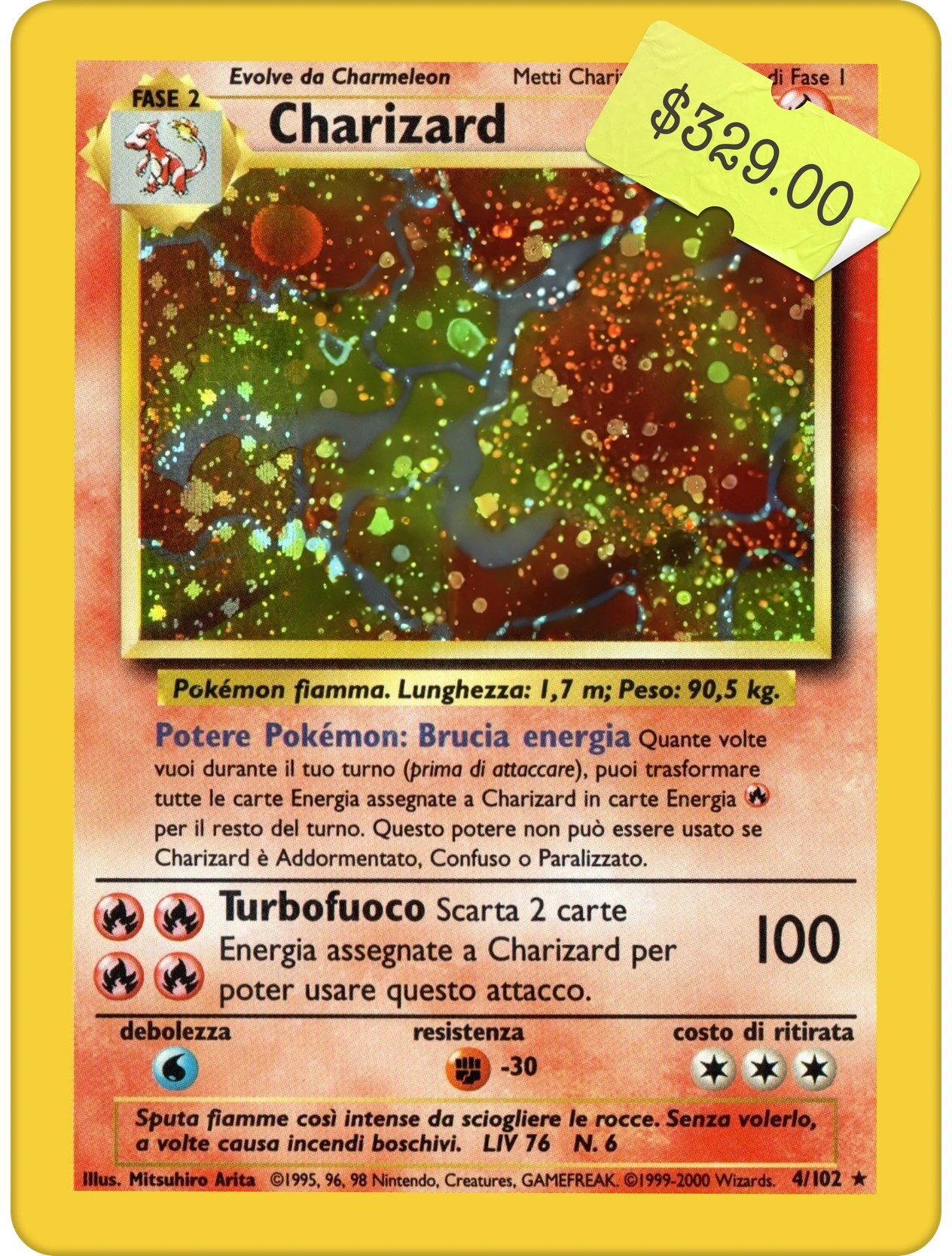

Drag anywhere on the stage to tilt the card, or hold the arrow keys.
The live component, numbered part by part. Every measurement is read from it as it is drawn. Point at a row to outline its part, or at a part to find its row.
When to use
- A hero object worth handling: a collectible, a membership card, a ticket or a reward the reader should want to pick up.
- Product pages where the object is the product, and turning it in the light says more than a second photo.
- A moment of delight on a page seen once or rarely: an unlock, a drop, a reveal.
- Art cut in two layers, a print and a figure, so the figure can float in front of the card.
When not to use
- Cards that carry actions or text to read. Tilting text makes it harder to read; use a plain card.
- Grids of many items. Each card wants its own stage and a hand on it; use a static thumbnail and open one card at a time.
- Anything the reader has to understand without moving it: under reduced motion the card stays flat, so say it all in the art and the label.
- A carousel or a swipeable list: sideways drags tilt the card here, so they can’t also change the slide.
You can add this component with the shadcn CLI or by hand:
Into components/holo-card of any React project, with no setup:
npx shadcn@latest add https://brunodelorence.com/r/holo-card.json- Copy the component files
Copy these files into one folder of your project, keeping their relative imports together, or download them as a ZIP:
- Copy the media files
To the same paths under your project’s public folder:
- Import it
As shown under Usage, below.
Either way it needs React 19 and a bundler that supports CSS Modules, such as Next.js or Vite. It has a dark colour scheme: it follows your page’s color-scheme, light unless the page sets one, or its colorScheme prop, with nothing to configure. Browsers without light-dark() show it light.
Usage
import { HoloCard } from './holo-card';// Copy cardbg.webp and charizard.webp to public/experiments/holo-card.// Disable the automatic demonstration so the reader controls the card.export function CardViewer() { return <HoloCard autoplay={false} maxTilt={10} />;}Each state below is a live instance, locked so you can study it.
The pieces it is built from, each with its measurements read live.
A collectible card with its printed $329 sticker, on a plain stage. Drag anywhere on the stage: the card turns around the drag’s axis, Charizard moves on a layer of its own over the foil, and a blurred white reflection travels the opposite way. Let go and every layer springs back to rest.
- Everything follows one value: the pointer’s offset from where it pressed, in the card’s own pixels, so it stays right inside a scaled container such as a gallery tile. A spring carries it, stiffer while held (420 / 34) than on release (180 / 20), and the frame loop runs only while something moves.
- The card turns with rotate3d around the axis perpendicular to the drag, and reaches maxTilt once the drag covers a tenth of the card’s width, so the side you drag towards sinks.
- The character is an image layer of its own and moves by the drag ÷ 30. The light is a blurred white bar clipped to the card’s face and laid under the character, so it passes behind it, moving by −drag ÷ 1.5.
- The whole stage takes the drag (touch-action: pan-y; a touch takes hold after 4 px), and a held arrow key pushes 38% of the card’s width. The demo drives the same code with a ghost pointer.
- The card is sized in container units, min(316px, 78cqi, 66cqh), on a 500 px stage: a 316 × 417 card. Only the card, the character and the light are moving layers, about 4 MB of GPU memory at 3× density.
- The stage, the card’s shadow and the focus ring are light-dark() tokens on the root, so it follows the page’s color-scheme, or the colorScheme prop. By day the card lies on a soft grey stage and casts a still shadow under the turning card; at night the stage is black. The card, its character and its light are the same on both.
| Prop | Type | Default | Description |
|---|---|---|---|
assetPath | string | '/experiments/holo-card' | Public folder holding cardbg.webp and charizard.webp; a trailing slash is fine. |
maxTilt | number | 10 | The most the card turns, in degrees. Clamped between 0 and 30. |
defaultTilt | { x: number; y: number } | — | Opens held at a drag, in shares of the card’s width (0.1 turns it all the way), until the reader drags or uses the keys. Turns the demo off. |
autoplay | boolean | true | Play the ghost-pointer demo while the card is on screen and untouched; false removes the demo and its pointer. |
colorScheme | 'light' | 'dark' | 'system' | — | Its colours: light, dark, or the reader’s system setting. Without it the component follows the page’s color-scheme, which is light unless the page sets one. |
className | string | — | Extra class for the root, the stage, for example to change its height. |
The complete source behind this demo. Open source under the MIT license, © 2026 Bruno Delorence: copy it, change it, ship it.
// Copyright (c) 2026 Bruno Delorence. MIT License.'use client';import { useEffect, useId, useLayoutEffect, useRef, type KeyboardEvent, type PointerEvent,} from 'react';import { DemoPointer, runDemo, type Point } from './demo-pointer';import { useAutoplay } from './use-autoplay';import styles from './holo-card.module.css';/* * Holo card: a printed trading card on a plain stage. Drag anywhere on the stage and the * card turns in 3D around the axis across the drag, while the character, a cutout of its own over * the printed art, drifts a little the same way, so it seems to float in front of the card, and a * soft white light slides the other way across the card. Let go and it all springs back. * * - Everything follows one value, the drag: how far the pointer is from where it pressed, in the * card's own px. A spring integrated frame by frame carries it: stiff while held, so the card/* Holo card (holo-card.tsx): the printed card in the middle of a plain stage. The card's width, --w, follows the stage's size; everything on the card is placed in shares of its box. Memory. A phone keeps a page's pixels in tiles the width of the screen, and a tile painted again gets a second buffer. So what moves stays off the page's tiles: the card is a layer of its own, and inside it only the light and the character are layers, of a fixed size, moved by their transforms. The stage is a size container of a set height, so nothing inside it ever lays out the page. Colours are the tokens below, light-dark(light, dark): the stage takes the color-scheme it inherits from the page (light unless the page says otherwise), or the one its colorScheme prop sets (data-color-scheme). The card, its character and its light are printed matter, the same on both. */.stage { /* The stage, and its edge: soft grey with a hairline by day, plain black at night. */ --surface: #ededf0; --line: rgb(0 0 0 / 0.05); /* The card's shadow on the stage, close and far: by day it lifts the card off the grey; at night the black stage needs none. */ --shadow-near: rgb(0 0 0 / 0.14); --shadow: rgb(0 0 0 / 0.24); /* The keyboard focus ring round the card. */ --focus: #1c1c1e;'use client';import type { CSSProperties, Ref } from 'react';/* * The demo's pointer, and the steps that move it. A demo is a script of awaited steps: wait, * glide the pointer somewhere, press, drag it along a path, let go, calling the component's own * handlers as a hand would. Stopping the demo (the reader takes over, or it scrolls away) ends * the step in progress at once: its promise rejects, which ends the script right there, and the * pointer fades out. * * Nothing the pointer does needs a layout. It moves by animations the compositor plays (a drag * too: the point handed to the component each frame follows that animation's clock); the press * scales a box that keeps a transform at rest, since a box that gains or loses one is laid out * again; and the arrow and the hand are HTML boxes that swap by their visibility (a change of * style inside an SVG lays the SVG out again). */export type Point = { x: number; y: number };export type Demo = { /** Resolves after `ms`. */ wait: (ms: number) => Promise<void>; /** Glides the pointer to a point of the screen, in client px. */'use client';import { useCallback, useEffect, useRef, useState } from 'react';/* * When a demo may play on its own: while part of it is on screen and the tab is visible, never * under reduced motion, and not while the reader is using it. `take()` hands it to the reader; it * takes back over `idle` ms after their last input. */export function useAutoplay<T extends HTMLElement>(idle = 6000) { const ref = useRef<T>(null); const [visible, setVisible] = useState(false); const [reduced, setReduced] = useState(true); const [taken, setTaken] = useState(false); const timer = useRef(0); useEffect(() => { const element = ref.current; if (!element) return; let onScreen = false; const update = () => setVisible(onScreen && !document.hidden); const observer = new IntersectionObserver( ([entry]) => { onScreen = entry.isIntersecting;- The card is a focusable image named for what it shows (“Charizard card with a $329.00 sticker, tilts in 3D”); a hint linked by aria-describedby explains dragging and the arrow keys. Keyboard focus shows a high-contrast ring, dark by day and white at night.
- Held arrow keys tilt the card and combine for diagonals; it springs back on key-up or when focus leaves. Arrows pressed with Alt, Ctrl or Cmd are left to the browser.
- A vertical swipe still scrolls the page. The reader’s first press or key stops the demo until 6 s without input.
- Under reduced motion nothing moves: no tilt, parallax or demo, and the arrow keys scroll as usual. Without JavaScript the whole card is rendered by the server.