
Clothing rail
NewA shop page with its garments on a clothes rail: the front one turns to face you, the rest hang side on.
clothing-rail/clothing-rail.tsxOn the railDelorence / North Quay
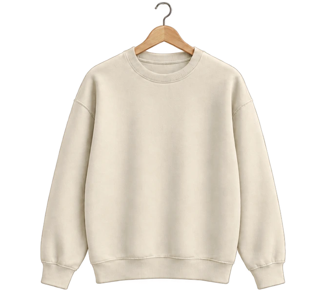
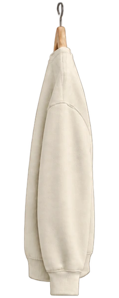
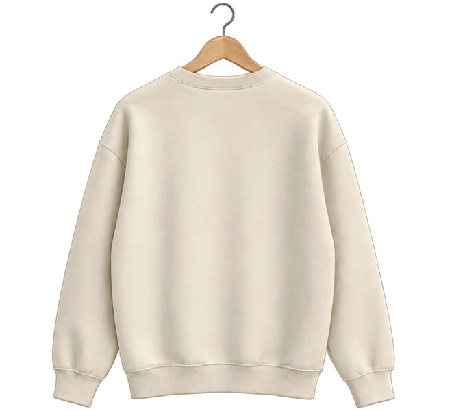
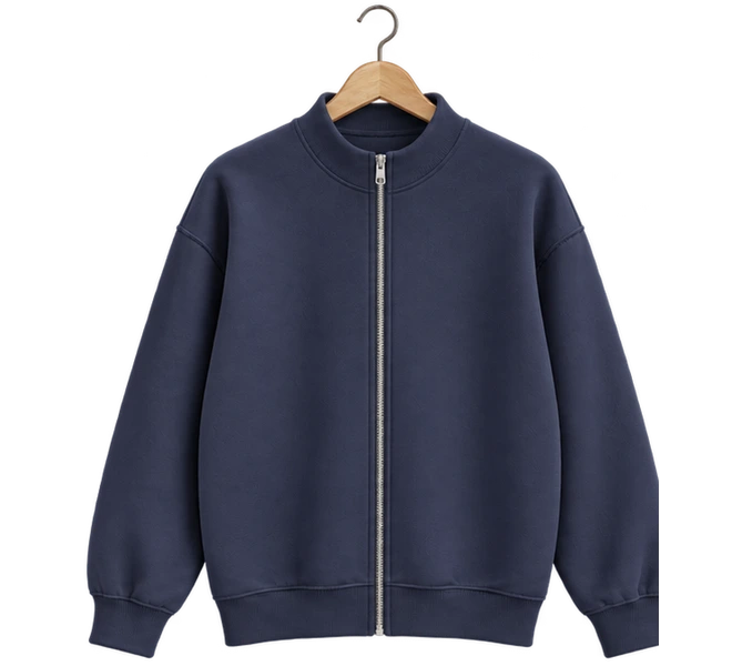
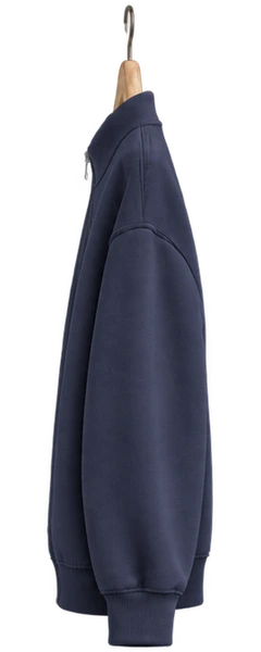
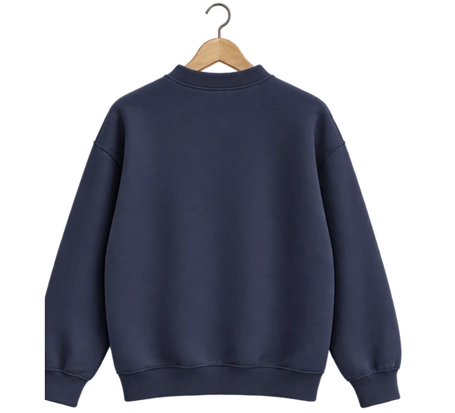
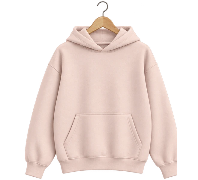
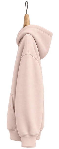
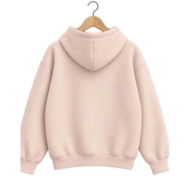
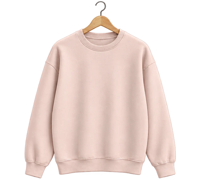
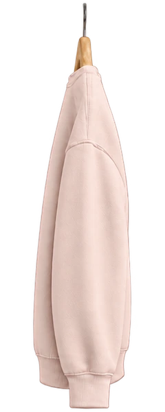
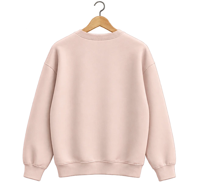
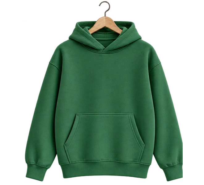
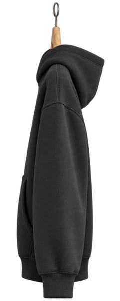
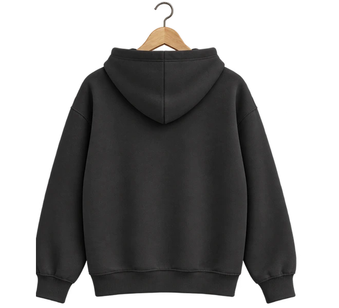
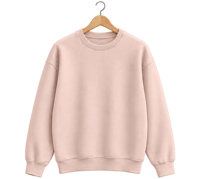
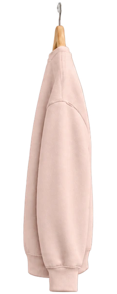
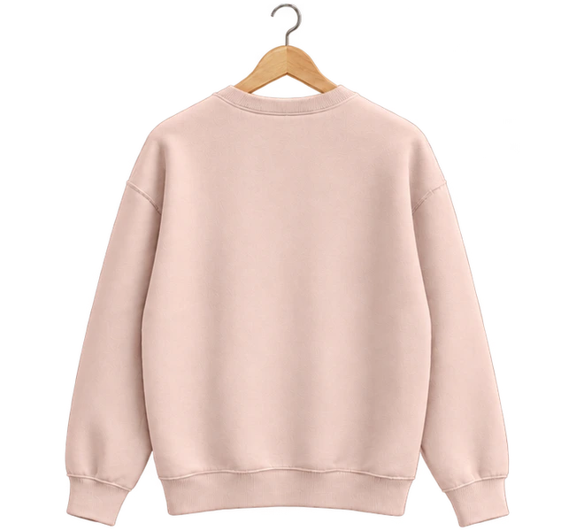
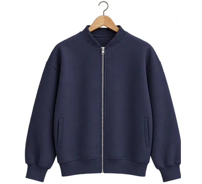
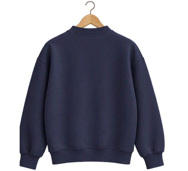
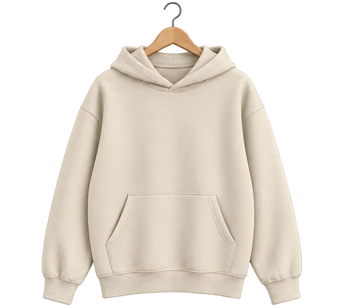
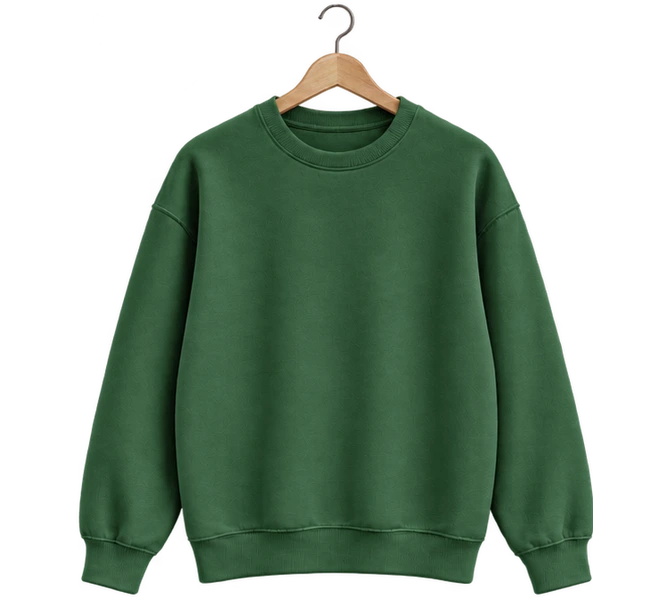
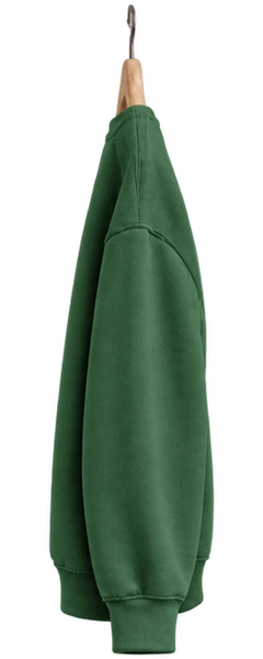
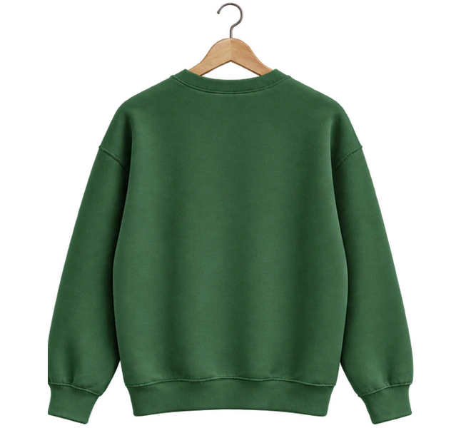
Orchard
Swipe to browse. Tap to explore.
Sewn slowly, worn daily. Cut & finished in small batches.
You can add this component with the shadcn CLI or by hand:
Into components/clothing-rail of any React project, with no setup:
npx shadcn@latest add https://brunodelorence.com/r/clothing-rail.json- Copy the component files
Copy these files into one folder of your project, keeping their relative imports together, or download them as a ZIP:
- Copy the media files
To the same paths under your project’s public folder:
/assets/6iL4gnPpdMJXOWFfkZvI0NoA0A.png/experiments/clothing-rail/fieldnote-front.webp/experiments/clothing-rail/fieldnote-side.webp/experiments/clothing-rail/fieldnote-back.webp/experiments/clothing-rail/low-tide-front.webp/experiments/clothing-rail/low-tide-side.webp/experiments/clothing-rail/low-tide-back.webp/experiments/clothing-rail/petal-front.webp/experiments/clothing-rail/petal-side.webp/experiments/clothing-rail/petal-back.webp/experiments/clothing-rail/orchard-front.webp/experiments/clothing-rail/orchard-side.webp/experiments/clothing-rail/orchard-back.webp/experiments/clothing-rail/fern-front.webp/experiments/clothing-rail/fern-side.webp/experiments/clothing-rail/fern-back.webp/experiments/clothing-rail/nightshift-front.webp/experiments/clothing-rail/nightshift-side.webp/experiments/clothing-rail/nightshift-back.webp/experiments/clothing-rail/rosehip-front.webp/experiments/clothing-rail/rosehip-side.webp/experiments/clothing-rail/rosehip-back.webp/experiments/clothing-rail/harbour-front.webp/experiments/clothing-rail/harbour-side.webp/experiments/clothing-rail/harbour-back.webp/experiments/clothing-rail/oat-front.webp/experiments/clothing-rail/oat-side.webp/experiments/clothing-rail/oat-back.webp/experiments/clothing-rail/moss-front.webp/experiments/clothing-rail/moss-side.webp/experiments/clothing-rail/moss-back.webp
- Import it
As shown under Usage, below.
Either way it needs React 19.2 and a bundler that supports CSS Modules, such as Next.js or Vite. It has a dark colour scheme: it follows your page’s color-scheme, light unless the page sets one, or its colorScheme prop, with nothing to configure. Browsers without light-dark() show it light.
Usage
import { ClothingRail } from './clothing-rail';import { ITEMS } from './data';const collection = ITEMS.filter((item) => ['Fern', 'Nightshift', 'Rosehip'].includes(item.name),);export function Shop() { return ( <ClothingRail items={collection} defaultIndex={1} brand="Delorence" place="North Quay" shopHref="/shop" autoplay={false} onOpen={(item) => console.log('Viewing', item.name)} /> );}A small shop’s page, phone-shaped. Its garments hang on a chrome rail: the one in the middle faces you, its neighbours hang side on. Swipe or press the arrows and the front one turns away, the rail carries them all along, and the next turns round to face you with a swing on its hanger. Tap it and it grows into a detail where Front and Back turn it round.
- The page is a column 360 units wide and 640 tall, and every size is in units of its width (a container query), so it is the same page on a 320 px phone and at 960; wider than 520 px, it stands in the middle at 400 px.
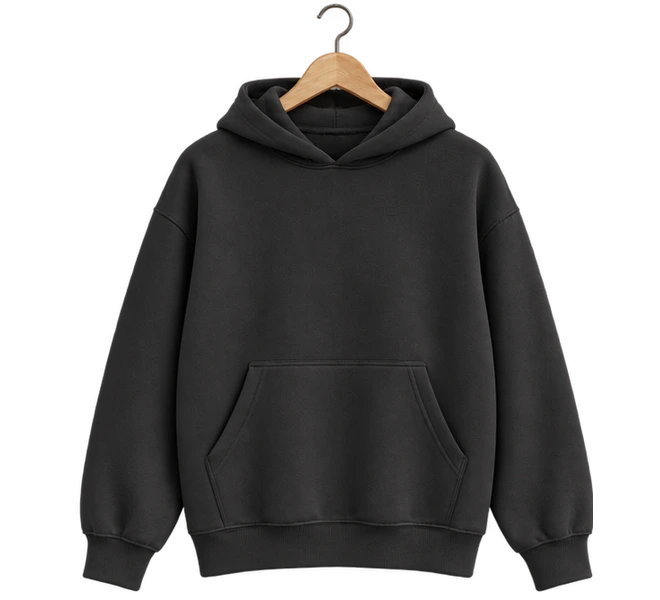
- Each garment uses transparent 3D product renders with sculpted fleece, hanging folds, ribbed cuffs and a wooden hanger. The Delorence logo and a text wordmark are applied over the fabric; both can be customized with brand and logoSrc.
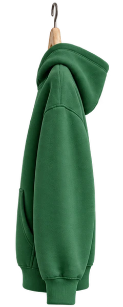
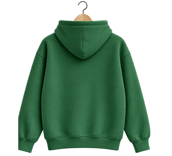
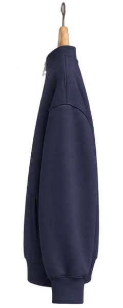
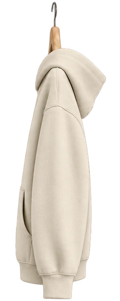
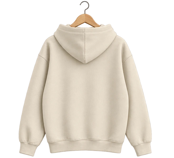
- A garment is a box of three images, front, side and back: the front and back stand 22 units off its axis, the side 60. Turning the box a quarter about the hook brings the side round, so the sleeves sweep away while the profile comes in. Each face fades only near edge on, so it never shows as a sliver.
- Moving along the rail plays in four steps, each picking up from where the last was if a new press comes in: the front garment turns side on (170 ms, easing in), the rail slides (260 ms, 110 ms more per extra garment), a 140 ms beat, and the new one turns to face you (320 ms, easing out).
- The script writes only transforms, one frame at a time and only while something moves. Two springs swing the hangers: one pulls every garment against the rail’s speed, so they trail and swing back when it stops; the other kicks the front one as it turns.
- The detail’s garment grows out of the rail’s: one 460 ms transform from the rail’s place and size to its own, while the sheet, which blurs the page behind it, fades in and the lines rise in turn. Front and Back turn the same box half round in 300 ms, and the underline slides with it.
- The red strip at the foot is one compositor animation that scrolls two copies of its lines, paused while off screen.
- Every colour is a light-dark() token on the root. At night the paper goes near-black, the chrome darkens and the garments keep their own colours. It follows the page’s color-scheme, or the colorScheme prop.
| Prop | Type | Default | Description |
|---|---|---|---|
items | RailItem[] | ten garments | The garments, in order: name, kind (hoodie, crewneck or zip), color, colorName and images (transparent front, side and back URLs). Optionally description, printColor (the logo and wordmark ink) and href. Align the three views to the same hook and hem. |
defaultIndex | number | 3 | The garment in front to begin with. |
onChange | (index: number) => void | — | Called with the index of the garment the rail moves to. |
onOpen | (item: RailItem, index: number) => void | — | Called when a garment’s detail opens. |
brand | string | 'Delorence' | The shop’s name: the header, the garment prints, the caption, the button and the detail’s footer. |
logoSrc | string | Delorence logo | A transparent logo URL, used as an ink mask in the header and on the garments. |
place | string | 'North Quay' | Where the shop is, after its name in the caption. |
railLabel | string | 'On the rail' | The caption’s first words, and the rail’s name for screen readers. |
marquee | string[] | two lines | The lines that scroll along the red strip, between stars. |
shopHref | string | — | Where Shop, Explore and a garment without its own href lead. |
autoplay | boolean | true | While on screen and untouched, a demo browses, opens a garment, turns it round and closes it. |
colorScheme | 'light' | 'dark' | 'system' | — | Its colours: light, dark, or the reader’s system setting. Without it the component follows the page’s color-scheme, which is light unless the page sets one. |
className | string | — | Extra class for the root. |
The complete source behind this demo. Open source under the MIT license, © 2026 Bruno Delorence: copy it, change it, ship it.
// Copyright (c) 2026 Bruno Delorence. MIT License.'use client';import { useCallback, useEffect, useEffectEvent, useId, useLayoutEffect, useRef, useState, type KeyboardEvent as ReactKeyboardEvent, type PointerEvent as ReactPointerEvent,} from 'react';import { ITEMS, KIND_LABEL, type RailItem } from './data';import { Garment } from './garments';import { createMotion, type Motion } from './rail-motion';import { useAutoplay } from './use-autoplay';import styles from './clothing-rail.module.css';export type { RailItem } from './data';/*/* Clothing rail (clothing-rail.tsx): a shop's page in a phone-shaped column, 360 units wide and 640 tall. Every size is in --u, a 360th of the column's width (a container query), so the page is the same at any width; the column fills a narrow stage, and on a wider one stands in its middle at 400 px. Colours are the tokens below, light-dark(light, dark) where the two differ: the component takes the color-scheme it inherits from the page (light unless the page says otherwise), or the one its colorScheme prop sets (data-color-scheme). The garments keep their own colours at night; the paper, the ink and the chrome dim around them. Memory. The column is one layout boundary. The garments move by transforms that the script writes one frame at a time, and only while something moves; each turns as a small 3D box of three product images. The marquee is one compositor animation, paused while off screen. */.root { /* The page and the stage around the column. */ --paper: #f3f4ed; --stage: #e6e7df; /* The words: ink, the softer grey of the hint, the faint one of the caption and counts. */ --ink: #0b0c08; --soft: #2a2b27; --muted: #74766d; --faint: #9a9d91; --tab-off: #8c887f;// Copyright (c) 2026 Bruno Delorence. MIT License.import type { CSSProperties, Ref } from 'react';import type { RailItem } from './data';import styles from './clothing-rail.module.css';/** Three transparent product renders share the same hook and rotate with the hanger. */export function Garment({ item, brand, logoSrc, turnRef, className = '',}: { item: RailItem; brand: string; logoSrc: string; turnRef?: Ref<HTMLDivElement>; className?: string;}) { return ( <div ref={turnRef} className={`${styles.turn} ${className}`}/* * The rail's motion: where each garment hangs, which way it faces, and how it swings, written * straight into transforms one frame at a time, and only while something moves. * * Moving to another garment plays in four steps, each picking up from wherever the last one was * when a new press comes in: * away the garment in front turns side on (170 ms, easing in); * slide the rail carries every garment along (260 ms for one step, 110 ms more per extra one); * hold a beat, all of them side on (140 ms); * toward the new one turns to face the reader (320 ms, easing out), with a kick on its hanger. * * - Positions: the front garment hangs in the middle, its neighbours under the rail's ends 142 * units either side (the column is 360 units wide), and the rest 64 units apart beyond them. * - Garments off to the sides all face the same way, as on a real rail: turned a quarter, so the * one that comes in turns the same way the one that leaves turned. * - The side face fades in from a third of the way round, so edge on it is never a bar. * - Swing: a spring per rail pulls every hanger towards an angle against the rail's speed, so the * clothes trail behind as they move and swing back when it stops; the front one has a spring of * its own, kicked as it turns. */export type MotionNodes = { slots: (HTMLElement | null)[]; swings: (HTMLElement | null)[];// Copyright (c) 2026 Bruno Delorence. MIT License./** Transparent 3D product renders, aligned to the same hanger hook. */export type GarmentKind = 'hoodie' | 'crewneck' | 'zip';export type RailItem = { name: string; kind: GarmentKind; /** Fabric colour, for the catalogue metadata. */ color: string; colorName: string; description?: string; /** Transparent front, side and back images with matching framing. */ images: { front: string; side: string; back: string }; /** Ink used for the logo and the brand wordmark. */ printColor?: string; href?: string;};export const KIND_LABEL: Record<GarmentKind, string> = { hoodie: 'Hoodie', crewneck: 'Crewneck', zip: 'Zip jacket',};'use client';import { useCallback, useEffect, useRef, useState } from 'react';/* * When a demo may play on its own: while part of it is on screen and the tab is visible, never * under reduced motion, and not while the reader is using it. `take()` hands it to the reader; it * takes back over `idle` ms after their last input. */export function useAutoplay<T extends HTMLElement>(idle = 6000) { const ref = useRef<T>(null); const [visible, setVisible] = useState(false); const [reduced, setReduced] = useState(true); const [taken, setTaken] = useState(false); const timer = useRef(0); useEffect(() => { const element = ref.current; if (!element) return; let onScreen = false; const update = () => setVisible(onScreen && !document.hidden); const observer = new IntersectionObserver( ([entry]) => { onScreen = entry.isIntersecting;- The rail is a region with the carousel role description. Only the front garment is in the tab order: a button named with its name, cut, colour and place (“Nightshift, Unisex hoodie · Charcoal. 6 of 10. Open the detail”). The product images and prints are decorative and aria-hidden.
- Left and Right arrows (and Home and End) move along the rail, as do the Previous and Next buttons, which are disabled at the ends. Each move the reader makes is announced in a polite live region.
- The detail is a modal dialog named by the garment: focus moves to Close, Tab stays inside it, Escape closes it, the page behind is inert, and focus returns to the garment. Front and Back are tabs with arrow-key movement, over a tabpanel.
- Under reduced motion the garments move and turn at once, the strip stands still and the demo never plays.