

Overview / Oitchau
Oitchau: a more human way to manage the working day.
Designing Oitchau’s mobile and web experiences — from a trustworthy clock-in to a clearer view of the entire team.
At a glance Bruno Delorence was Head of Design at Oitchau from 2019 to 2023, part of the founding team of the São Paulo time-tracking and workforce platform. He shaped research, UX/UI and design systems across iOS, Android and web: a facial-recognition clock-in, the employee mobile app and a modular manager dashboard. Reported outcomes: 85% fewer recognition errors for Black users, 80% company adoption in the first year, time to value cut from 10 to 2 days and +50% dashboard retention.
The complete presentation · PDF · 31 pages
Fewer recognition errors for Black users
Facial recognition · page 12Company adoption in the first year
Facial recognition · page 12Time to value on the dashboard
Dashboard · page 31Results reported in the project presentation.

Where it started
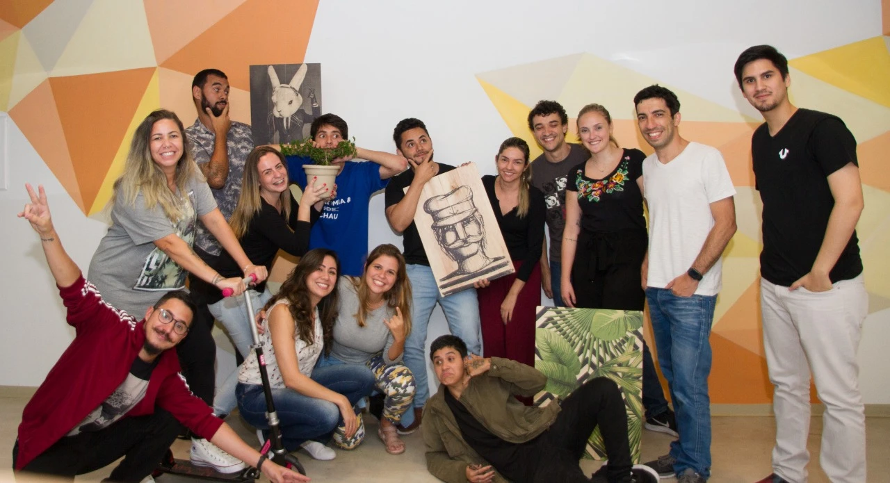
Part of the founding team.
I was part of Oitchau’s founding team, shaping the product from its very first version.
I also saw the first boleto, a Brazilian bank payment slip, paid for the solution we created.
00 / The approach
A product process that stays close to people.
Oitchau brings time tracking, attendance, payroll workflows, and workforce visibility into one platform. Employees need a simple daily tool. Managers need reliable information to act on.
My work connected design, stakeholders, and engineering: defining the process from research to implementation, aligning business needs, and iterating through qualitative and quantitative feedback.
The process today
How does the process for each stage of creating a feature or new product work today?

- 01 Topdown decision goes to the design team.
- 02 Clients needs go to the design team, and the design team loops back to clients needs for feedback.
- The design team, led by Bruno, turns both inputs into the product.
- 04 Product launch follows the design team.
- 5 Monitoring follows the launch.
Understand
Planning, research, and information architecture. Start with customer needs and business priorities.
Make & validate
Explore wireframes, visual direction, and prototypes. Test with users and work with engineering through handoff.
Learn after launch
Monitor feedback and bugs. Review use over time and feed what we learn back into the product.


UX Design 01
Project scope definition.
- 01.Planning
- 02.Research*validation or invalidation of the product
- 03.Architecture (UX)
- 04.Checkpoint
- 05.Analysis and testing*on average in projects over 6 months of development
UI Design 02
Project creation phase
- 06.Immersion
- 07.Moodboard
- 08.Wireframe, Key visual
- 09.Prototype (UI)
- 10.Handoff, Tech / System

Monitoring 03
Product goal tracking phase
- 11.Test group
- 12.Launch, Bugs & client review
- 13.3 months of use, Review
- 14.6 months of use

01 / Facial recognition
Trust at the very first touchpoint.
Colleagues clocking in for one another created a real problem for managers. Facial recognition could help — but only if it was fast, affordable, and reliable for the people using it.
The challenge
Security cannot come at the expense of usability.
65% of the managers interviewed reported time-clock fraud. The design challenge was to verify identity without adding friction to a routine employees repeat every day.
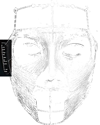
We researched biometric patterns, ran an MVP with 50 selected companies, and worked to bring authentication below two seconds.


Center your face and mark
your spot
Unlock Oitchau App with your face ID,
quick and secured



Thursday, March 19, 4:09 PM
Your facial record is protected
Amanda Ribeiro
Head of Products





What testing revealed
A working feature is not enough if it does not work for everyone.
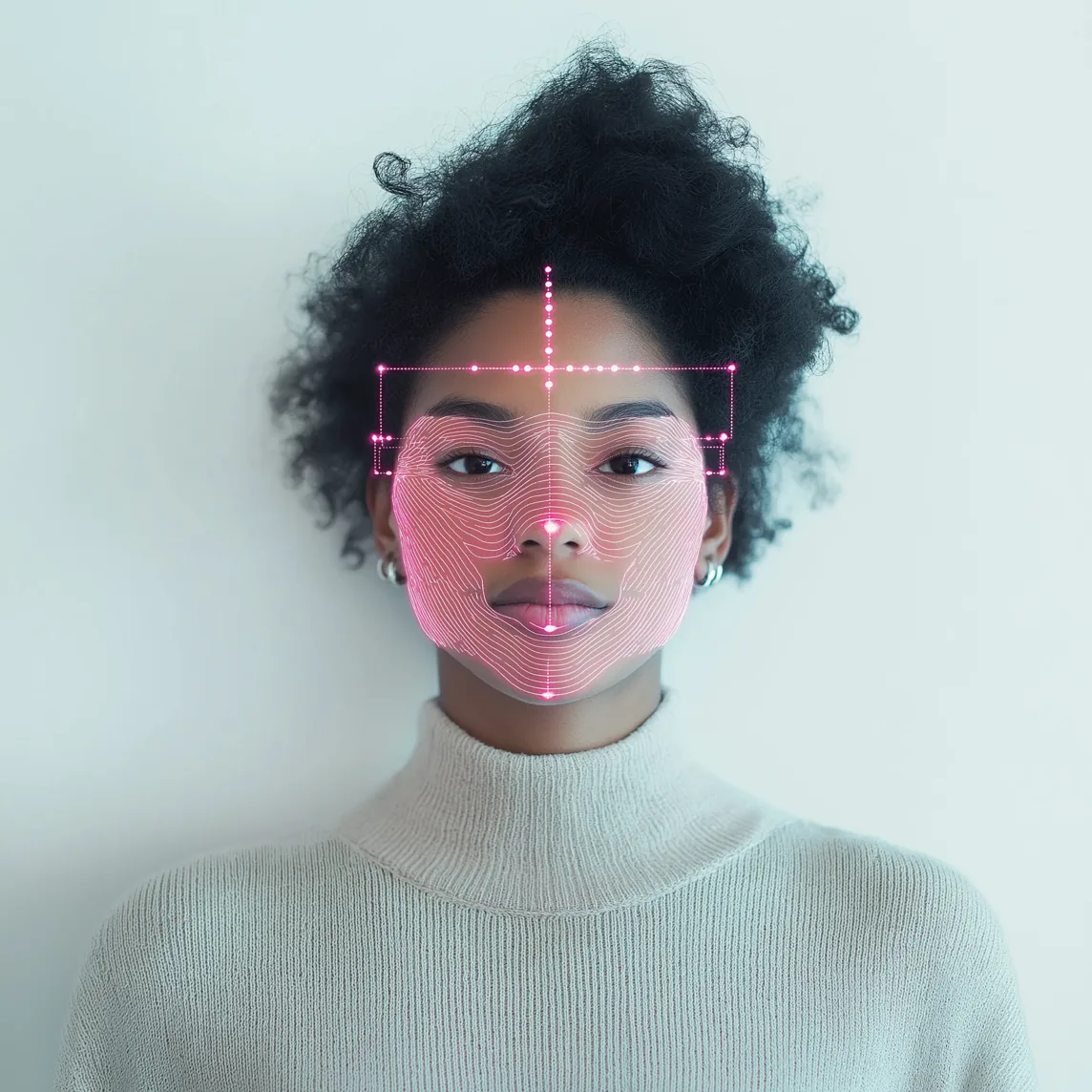
Tests revealed higher false-negative rates for darker skin tones. The case recorded an 18% false-negative rate, making fairness a core part of the work.
The team expanded the training database, tested with more diverse groups, and established ongoing feedback to identify new failure cases.
In the interface, failed verification led to an approval request a supervisor could review, giving employees a way forward.


Thursday, March 19, 4:09 PM
Your facial record is protected
Gisele da Silva
Recruitment Analyst



Sorry Gisele, we couldn't
verify your identity
Submit a time clock request, your supervisor can review your time and adjust if necessary, or try again


Time adjustment


Gisele da Silva
Recruitment Analyst


Start
08:32
End
12:00
Category
Face recognition failed
Comments
The employee couldn't clock in because their photo didn't match the one on file




After implementation
Keep a human in the decision.
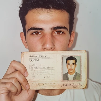
Potential fraud required a separate response from technical failure. Managers needed enough context to review a flagged request, reject it, or approve it with a comment.
The goal was to support a decision, with visible evidence and a traceable action.




Possible fraud attempt
detected!
We identified an inconsistency in this timesheet. Please review the data before approving.
Results
- 85% reduction in recognition errors for black skin profiles.
- Feature adopted by 80% of registered companies in the first year.
- 30% increase in employee satisfaction regarding the tool’s usability.
Customers who adopted the feature



Outcomes reported in the project presentation, facial recognition chapter (page 12).



Thursday, March 19, 4:09 PM
Your facial record is protected
Amanda Ribeiro
Head of Products


02 / The mobile experience
Less time managing time.
For employees, time tracking should fit around the working day. The mobile experience brought schedules, clock-ins, requests, and activity into a tool they could use wherever work happened.
A lesson about the audience
The person using it is not always the person buying it.
The early work focused on the employee clocking in. The presentation reflects on nearly two years without revenue before recognizing a crucial gap: the buyer's needs deserved the same attention.
The product had to serve both sides — a quick daily experience for employees and meaningful control over schedules, overtime, and approvals for managers.

The starting point
A daily routine with unnecessary friction.
Physical time clocks and fragmented records created queues and made it difficult for employees to understand their hours. Managers lacked a clear view of what was happening.
The design direction
Make the next action obvious.
We brought the schedule, current status, and clock-in action together, then explored how requests and activity details could follow the same clear interaction patterns.
From structure to interface
Make the workflow clear before adding the detail.
Wireframes connected the key tasks and established the hierarchy. Interface iterations then developed the visual language and reusable patterns across the product.
Isometric wireframe of the Oitchau mobile clock-in screen, layer by layer.
The solution
The working day, at a glance.
Two primary actions — “Oi” to clock in and “Tchau” to clock out — simplified the main flow. Distinct labels and contrasting colors made each action recognizable, while the daily agenda showed progress through the working day.
Activity details and requests extend the same experience, keeping the information people need close to the task.


Diego Monteiro
Product Designer
21:44
UTC +12
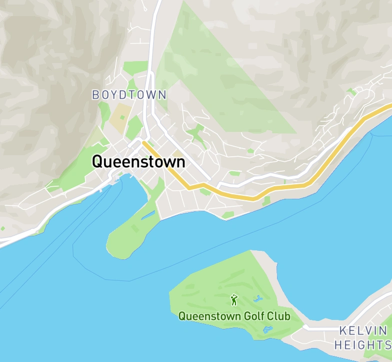
Queenstown

Office Queenstown - NZ


Break Start
 Punch In
Tuesday, Oct 13, 2020
16:00

Agenda

Clock in
30 min late
8:30

Break start
12:00

Break end
13:00

Clock out
Planned
18:00
 Dashboard
 Requests
 Today
Today
 Chat
Chat Profile
Visual feedback
A little clarity goes a long way.
Purpose-built illustrations and explicit confirmation states help people understand what happened and what to do next, from a successful request to a recorded clock-in.






Request approved
We sent an email with the details of your request, you can check it now

Clock in, follow your agenda and track your hours, all in one app.

Tuesday, Oct 13, 2020
16:00
Agenda
Clock in
30 min late
8:30
Break start
12:00
Break end
13:00
Clock out
Planned
18:00
- Dashboard
- Requests
- Today
- Chat
- Profile
Keep your subscription active
Add another payment method in case of issues with the primary one.
Thursday, March 19, 4:09 PM
Your facial record is protected
Amanda Ribeiro
Head of Products


Do you want to delete this alternative payment method?
Are you sure you want to delete this credit card? This action cannot be undone.
 Yes, deleteNot now
New card
Debit or Credit
Request approved
Send a copy of the approved request
to your email for your records.


You can now add an alternative payment method for your Oitchau subscription.

Monthly subscription
Your subscription is up to date
Active
Next invoice: May 25, 2022
Billed monthly
 Visa · primary cardChange
03 / The strategic dashboard
From more data to better decisions.
The dashboard needed to help leaders spot problems and act. The next challenge was turning a dense operational view into a useful, adaptable decision-making tool.
The initial challenge
Too much effort before the first useful insight.
A complex interface, information overload, and limited customization slowed adoption. A long time to value meant managers had to work too hard before the dashboard became useful.
The decision
Make room for each company's priorities.
User research and iterative testing informed a modular approach. Companies could tailor the dashboard to their needs, reducing cognitive load and making relevant information easier to find.


This dashboard plays an automatic demo: a virtual cursor tries its controls and rearranges its cards. It pauses while you point at, touch or focus the dashboard, and resumes a few seconds after you leave.

 Today02:10:37
Notifications
Bianka clocked in at 08:02
5 min ago
Leo requested a time adjustment
20 min ago
December time bank report is ready
Yesterday


Filters
- Brazil
- All subsidiary
- Dec 01 - Dec 31 - 2022

Active employees
Period: Last 6 months | Frequency: Monthly view
Employees by Group
Period: Last 6 months | Frequency: Monthly view

Total time bank

Employees
Accumulated time bank
Accumulated time bank: 556:34:00, up 56:10:78 (+14%)

Company Health score
This score is considered to be Excellent.






Your score for Q1 2022
You saved 224:43h in extra hours

Time bank
Period: Frequency:


Monthly employee
This score is considered to be Excellent.



Diego Monteiro
48 major tasks completed in the last month
- No overtime this month
- Team average: 4.3 of 5


Time bank by department
This score is considered to be Excellent.


Monthly time bank
This score is considered to be Excellent.
Positive time bank by employee
This score is considered to be Excellent.
AI in the product
Helping managers spot what needs attention.
Oitchau HR Assistant brings AI-assisted analysis and anomaly detection into the product: it highlights deviations so managers can investigate before they add up. It is shown separately from the reported results below.

Analyze
Built for HR teams — Spot overtime, absences and late arrivals across your entire team, and act before they add up.

Review anomaly
Anomaly detected!
Employee task
100h
10h

Jan 1
Jan 8

Expected
Employee
Diego Monteiro
Leo Ramalho
Budget
60h
60h
Expected
30h
30h
Type
100%
100%

The outcome
- 10 → 2 days
- Time to value
- +50%
- Dashboard retention
- Modular
- Schedule management tailored to each company
Outcomes reported in the project presentation, dashboard chapter (page 31).
The full story
Every screen starts
with a real problem.
Explore the complete process, interface studies, and results in the 31-page presentation.
Download the presentation Next project · Workbench ↗︎
Start a conversation
Let’s talk about your product, your team, and where design can create the most value.
- Call duration
- 20-30 minutes
- Topic
- Design engineering
- Price
- Free